Unleashing the Boundless Potential of Modern Workspaces
written by: carmen bowering & christine young
studios: mknly interior design / mknly procurement
team: walker mckinley / christine young / carmen bowering
How can an office be a destination? A space that feels like someone's home, but better? These are concepts that were first discussed in preliminary design kick-off meetings for a new property development company’s inaugural home base in downtown Vancouver
Breathing New Life into the Traditional Office Concept
It's not enough that workplace projects are driven by maximizing functionality and productivity. Instead, workplaces must be infused with hospitality, socialization, and brand identity. The modern office has evolved not only in aesthetics but also in layout. Long ago veering away from stuffy cubicles, workplace design shifted towards private offices along a building core with open workstations along the windows to allow natural light to infuse the employee’s workday. Then for some, it shifted again, and private offices were eliminated in favor of the total open office design. Others still pushed the envelope further by incorporating hot desks; no one owned a spot and desks were occupied on a first-come first-serve basis. Today, many companies are still figuring out what type of office approach works best for them, especially after working from home was commonplace during the pandemic. So, where do we go from here?
For our client, this contemporary office project centered around an intention of collaboration. This concept is the core of their identity, their work, and therefore their new office. Collaborative reciprocal inspiration starts with a human-centric approach. It had to reflect an integration of the different minds from all disciplines, and above all else, the future inhabitants.
An Office With a Narrative
This client came with a vision to have an office that stood apart from the rest. She was after a space that emulated her brand, offering an experience that was untraditional, interactive, and ambitious. An artist herself, she dreamed that this space could act as a showcase for work by local artists.
We took this vision and began to contemplate how we could infuse these ideas into a place of work. The evolution of our thoughts broke down into four design pillars that would form the structure of the design ethos. The space had to be artist-led, ambitious, collaborative, and differentiated. Artist-led translated to a surrealist, immersive, and playful space. An ambitious space had to be innovative, original, and grand. A collaborative space had to be unexpected, fluid, and responsive and finally, a differentiated environment was luxurious, iconic, and bold yet understated.
Visual Ethos: artist-led, ambitious, collaborative, differentiated.
A Radical Method
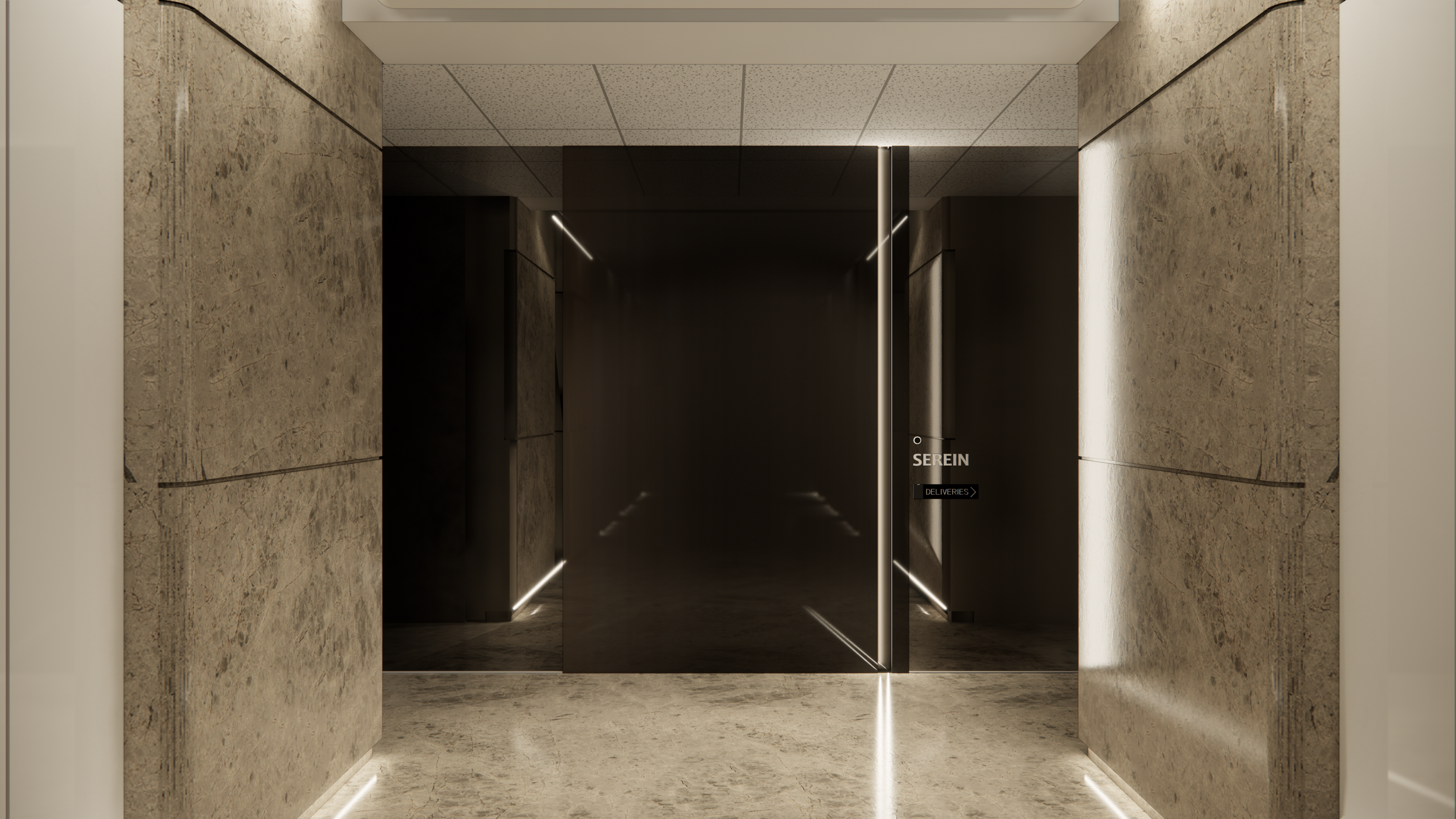
Creating memorable and experiential moments for people was a primary goal since the inception of this project. The user experience was the biggest driver for the client. In response to the request for an elevated entry experience, the main door is designed to emulate mystery, exclusivity, and sophisticated grandeur by playing with scale, mass, reflectivity, and light. Beyond the front door, immediately entering the office, is a lounge and bar that provides a fluid setting for receiving guests, casual client meetings, project launch events, and after-hour socials.
The showstopper however, is the custom curved glass and wood form in the center of the space. It's a sculptural piece that serves multiple functions as a meeting and immersive room. This freestanding element breaks from the traditional mindset that rooms must be positioned along a grid or married to the building core or envelope. People can meander around the exterior of the glass room, where the curvature creates a private nook to take a call or have a quiet moment to take in the view. Around the other side, they pass through a corridor where they can take in the surrounding art and be led to the immersion room, where a 360-degree AV experience takes place that presents the company's projects and branding media.
Grand, experiential entry using reflectivity, mass, and light.
Sculptural, curved form creates differentiated spaces.
Bold Yet Understated
We took the opportunity to explore materiality and texture in unconventional ways to depict the contemporary and bold characteristics of the company's brand. Tinted mirror is seen in unexpected places – not only at the entrance but on the bar and as cabinet doors that conceal storage. It contrasts with the dramatic movement of the marble kitchen inset into the millwork. Similarly, the central curved form has simple materiality where glass transforms into wood, a bold detail done in a pared-back, elemental way. Additionally, designer furnishings act as conversational showpieces and portray the company's sophistication and design-forward values. Sculptural with a sophisticated eclecticism, each furniture piece has something to say.
With surrealism, immersion, and playfulness at the forefront of our minds, we continue with ongoing development to integrate an art installation into the lounge and provide moments throughout the space to display local artwork.
Reflectivity and boldness in a fluid social space
We started this project wondering how we could redefine what an office has to offer and give this new business owner a chance to tell her story. Ultimately, this space sets the stage for a workplace that blends business with hospitality by promoting social interaction, relationship building, and experiential design. We strove to emulate the essence of the company's brand and give them a setting for their business that will stand apart from the rest. We took an unconventional approach to this office design by removing the boundary between art, the built environment, and the human experience, encouraging thought on the relationship between all three elements.


