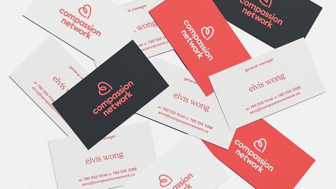
compassion network identity
Freedom and independence informed the creative direction for Compassion Network's rebrand. By exploring the intersection of freedom of play with the dignity of aging well, the logo evolved to depict a hand drawn heart with a loop–Compassion Network's version of an infinity sign. mknly brand deconstructed healthcare colour applications and developed a unique formula that Compassion Network could call their own, 'Nectar' embodies vitality, emotion, affection and freedom.
Photography played a vital role in how the brand was received. By focusing on a clients' needs and quality of life as opposed to service-based care, we kept the spotlight on aging well and independently. With respect to typography, mknly brand chose an easy-to-read and classic serif font to complete the vision.


